Assignment: Flexbox Exercises
Construct a couple of flexbox based components.
Requirements
-
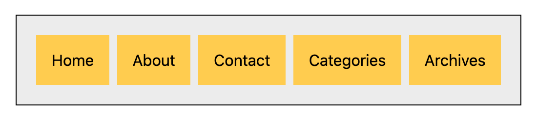
Create a horizontal navigation bar. The items can stretch to fill all the available width, or be distributed.
Include about five items in your nav. For example, you can use: Home, About, Contact, Categories, Archives.
-
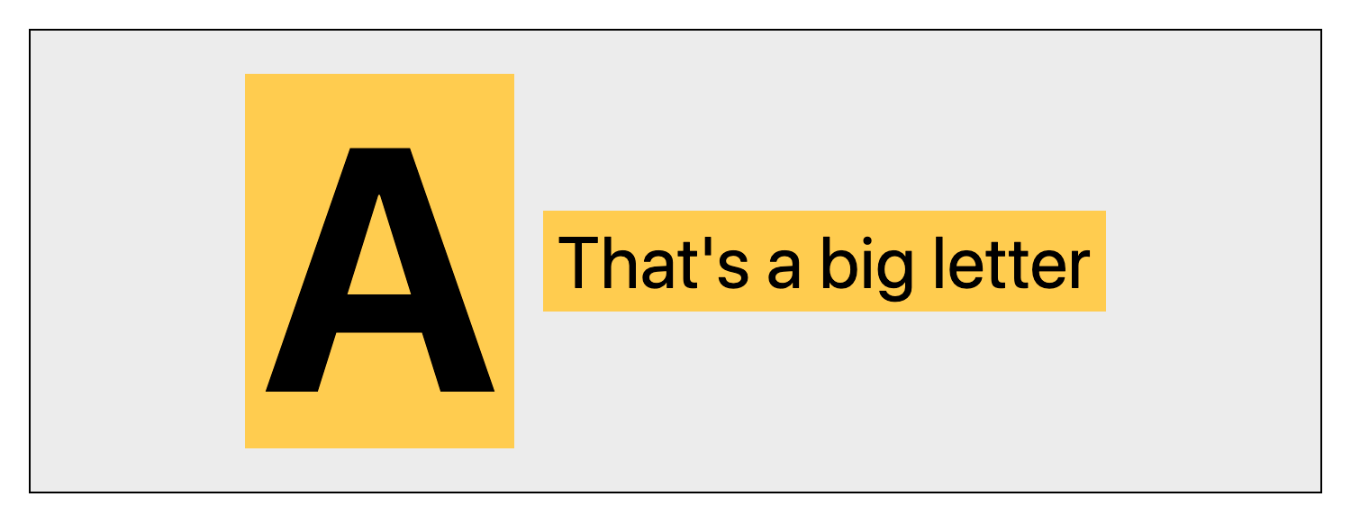
Create a responsive stack. Create a container with two items that stack on mobile, and switch to a row on wider viewports. The first item in the stack should appear on the right when the items switch to a row. (Hint: Both the stacking and the order of items as a row can be set up using
flex-flow.)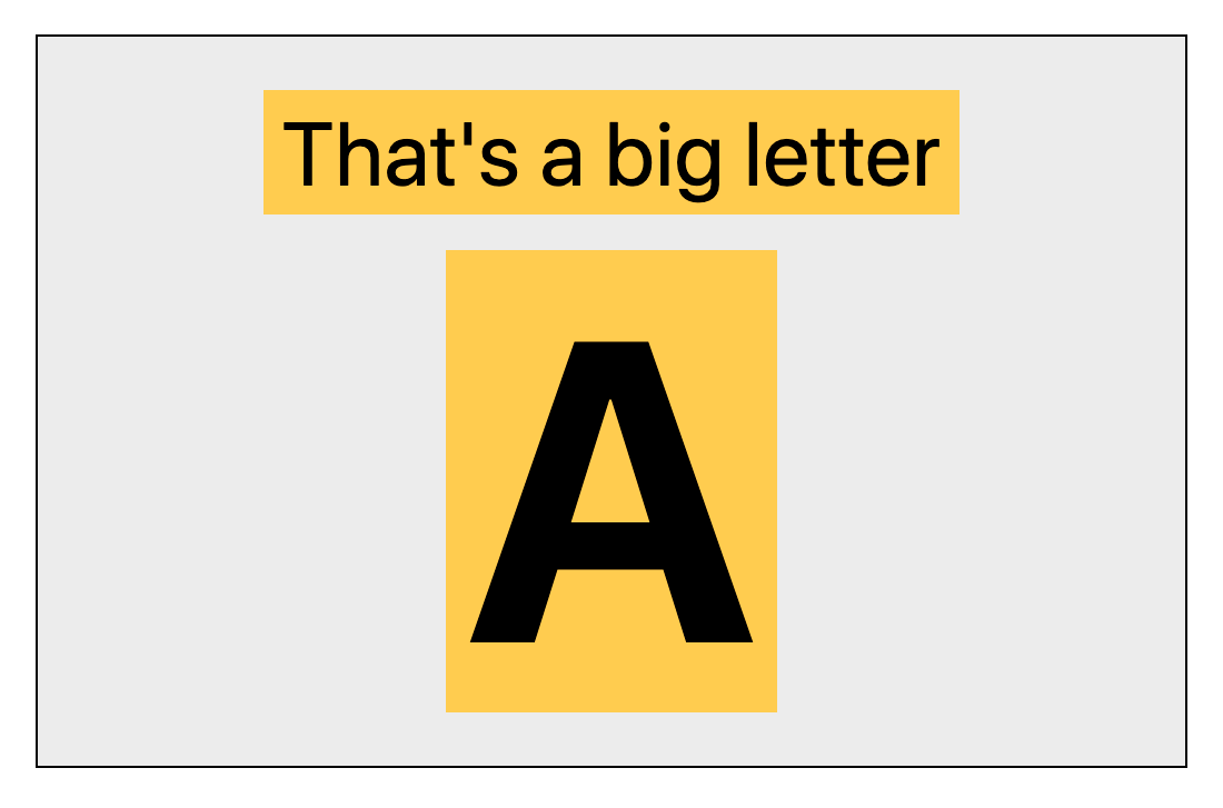
Construct everything in single HTML page and use a single stylesheet.
Use a unique class name for each component, so that the CSS rules don't overlap or conflict with each other.
Your components do not have to match my screenshots here exactly. Feel free to style and color things as you like, just make sure to use backgrounds and/or borders to clearly show the sizes and spacing of the flex items.
The page should have a wrapper or some other kind of container to keep everything to a reasonable max-width. Center everything with auto left and right margins. Make sure the page is fluid when you shrink the viewport down though (no min-width)!
Goals
- Learn to effectively set up flexbox, understanding the parent-child relationship of elements in HTML.
- Practice building a whole-page layout where the overall container determines the size of all the contents. (This is also practiced in Long-Form Text.)
- Practice working with flexbox in a few different forms, showing some of the ways it's used in web page layouts
- Practice creating "scoped" (isolated) styling rules using containers in HTML, and unique class names in CSS, to prevent rules from overlapping or conflicting.